Building Next Generation Brand Sites
Overview
As a developer for the Branded Sites team at General Mills, we build and maintain brand sites for hundreds of brands in our portfolio. Each site has different goals, brand managers, and budgets. We needed a product that we could offer that is modern, fast, reliable, easy to work on and maintain, and delivers a great user experience for everyone.
Key Components I Delivered
- Rating and Review Client-Side Component
- Server Side API Routes to Submit Ratings
- Detached Wordpress CMS Setup
- Bazaar Voice Integration
Technology Used
- NextJS
- React
- GraphQL
- Webpack
Link
Table of Contents
Why a Headless Front-End?
General Mills has a large portfolio of different brands in different regions around the world. As a result, each branch varies in its needs and budget. This means the content that appears on the site ranges from a simple static entry in CMS like WordPress, or advanced profile and product data that comes from internal APIs. There is also the benefit of not being tied to a specific CMS provider. For example, sites at General Mills use Sitecore, this is a paid service and if you are using their base framework, your site is tied to that contract and will not work without it. With a headless solution, you could migrate the CMS data and keep the front end work with the same functionality. It gives us flexibility in pricing and contracts to ensure we can make the best decision as new opportunities come up as we won’t be locked to past decisions.
Why did We Pick this Framework?
![]() Next allows us to pull data from all the different sources in the best possible rendering method as we can do it at build time for static data, server-side for api requests, or even client site to integrate with our vendors. The team was also familiar with React as we have done Gatsby projects in the past. React doesn’t seem to be losing momentum anytime soon as well.
Next allows us to pull data from all the different sources in the best possible rendering method as we can do it at build time for static data, server-side for api requests, or even client site to integrate with our vendors. The team was also familiar with React as we have done Gatsby projects in the past. React doesn’t seem to be losing momentum anytime soon as well.
My Role on the Team
My official title on this team was Advanced Developer, otherwise known as Engineer 2 across the industry. A unique advantage I had is that I came from an analyst background and have experience leading projects.
Project Management
Specifically for the Rating and Review feature, I lead a team of designers and producers, as well as the relationship with our vender for syndicating reviews to our partner, [Bazaar Voice]. I created our JIRA board, development process, wrote the bulk of our user stories as well as led all UAT (user acceptance testing) and design reviews.
Design
Design has always been a passion of mine, including taking every art class my schedule allowed when studying computer science and I enjoyed being part of the design process for this component. This was highly beneficial for the ratings and review project. I worked collaboratively with the designers on our, gave feedback on the design standards, and ultimately guided the handoff process that allowed me to hit the ground running when stories were ready.
Development
I built it.
Obviously there’s a bit more to this but I did the discovery for the service we were consuming, wrote our server side api routes, and build the front end components to allow for Ratings and reviews. I also contributed to our product base by setting up the headless CMS standard and installing the GraphQL plugins.
Accessibility
General Approach
It’s important. Everyone deserves the ability to navigate the fruits, and yes, even the toxicity of internet. At General Mills, we were fortunate enough to work with a tremendous accessibility partner, WeCo. Members of that team would navigate through the products that we build and allowed us to view how users navigated the site when using tools like screen readers. Seeing this in person allowed us to make the best product possible.
Read More / Read Less
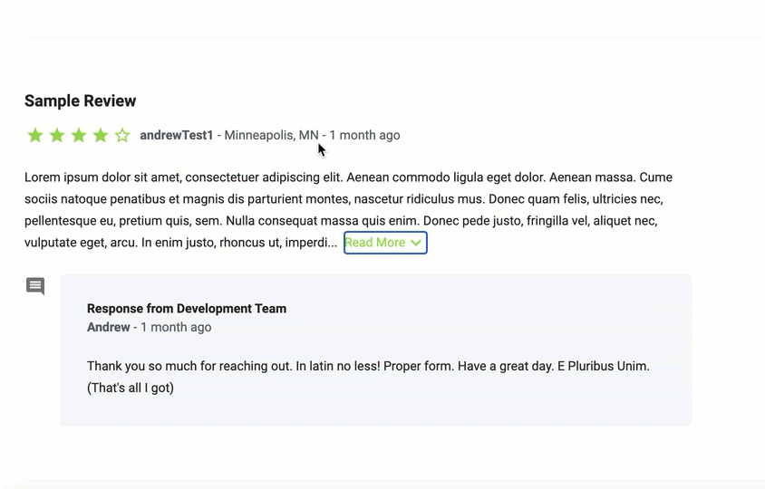 A surprisingly hard feature to get right is Read More / Read Less. Getting the user to not lose context when expanding the paragraph to review is tricky. I had to trap focus and move the user to the review title that I gave a tab index. There’s still some repeat material but the user isn’t lost or sent to the top of the page. The best recommendation here is to only use it in extreme cases!
Screen Takeovers
For writing a review, the design consisted of a full screen takeover so the experience is clean and not distracting. The key learning here to to trap the users’ focus and not allow them to tab out of the input elements to elements that are hidden by the takeover. I also used a plugin that disables scroll behind the takeover so the user isn’t lost when the takeover closes.
Outcome
Our team delivered the solution months ahead of time and migrated 7 sites onto this new platform. Product nutrition and ingredient information has been more reliable since it doesn’t have to be manually updated, we simply get the current version from our product service. Ratings and Reviews has also been implemented, allowing us to build community with our users. The component that we build for it far exceeds the accessibility standards of out of the box options.